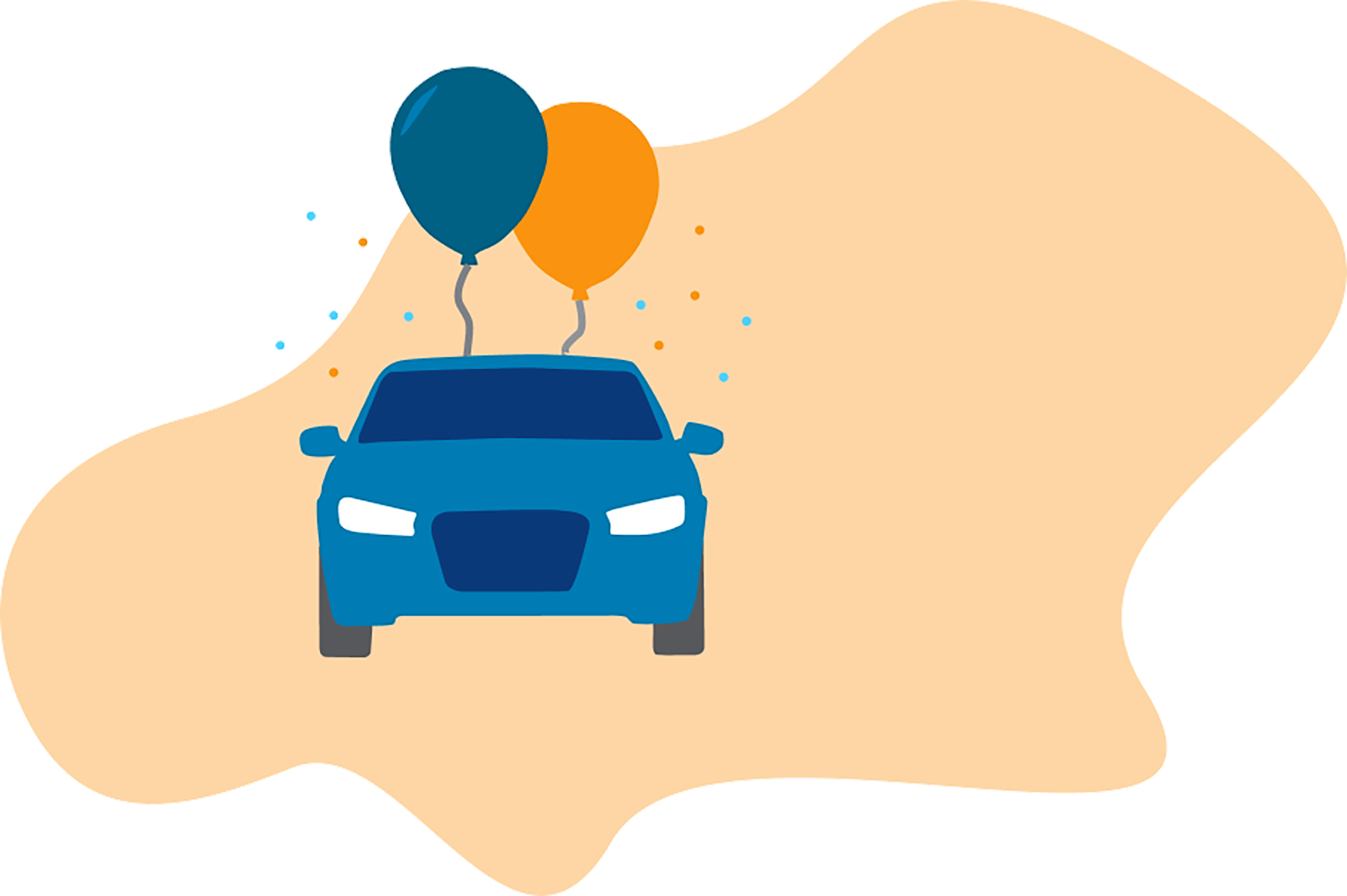
Kaus is an insurance company with more than 30 years of experiences. This year, they are planning to tap into a more digital-based approached to sell individual insurance that appeals to a younger audience. Kaus has a wide range of insurance policy offerings and would like to prioritize in providing easy solutions for customers, allowing customers to customize their policy choices, and a refreshed brand.
Client: Kaus
Timeline: 80 hours over 4 weeks
Tools: Photoshop, Illustrator, Figma
Deliverables: Responsive website and new brand identity
The goal for the project is to address the factors that might hinder the overall insurance buying experience such as coming up with ways to present information in a less intimidating and tedious way, educate potential customers on what types insurance there are and how to purchase the plan that works. In addition, create a new brand identity to engage with a younger audience.
For this project, I went down the design thinking process. The empathize phase helped identify research goals and assumptions. After that, I was able to define the problem. Defining the problem allowed me to start ideating. With preliminary ideas defined, I was able to jump into prototyping and start testing with potential users.
I kickstarted the project by going through the empathize phase. This phase involved market research and understanding what users need and want. To begin, I first laid out some research goals and assumptions. These provided a good foundation as I moved onto to other research methods such as competitive analysis, crafting a survey, and conducting user interview questions.
In order to understand how people currently purchase insurance, I needed to do some research. I opted for competitive analysis for a quick way to look into how other insurance companies are doing. Secondly, I sent out a survey - in hopes to use it as a platform to gather quick insight and screen participants that would be interested in doing a user interview. Last but not least, I conducted user interviews to get a more detailed overview of the goals and frustrations when it comes to buying insurance.
Kaus wants to join other insurance companies for a better online presence and start selling insurance online, I looked at other existing websites to gauge how the insurance-buying process differs between different companies and how other companies have succeeded in doing so.

Respondents: 31
Age Group: 16 to 55
Overall Experience (Scale of 1 – 5): 3
I reached out to people through social media (e.g. Facebook and Instagram) and got a response from 31 respondents. The purpose of the survey was to also help me identify the key users I want to be interviewing to get further insight.
Number of Participants: 8
Age Group: 19 to 29
Average Interview Session: 45 Minutes
I conducted interviews with 8 individuals. Unfortunately, due to current circumstances, it was difficult to target a more diverse age group. All of them own a car and most of them are currently renting an apartment with health insurance offered through work.
After synthesizing the research I did in the empathize phase, I created ‘Jessica’ - she represents the most common findings. When piecing together the persona, I looked for patterns in the goals, needs, pain points, frustrations, motivations and wants of the users I interviewed.

The empathy map I created was based on the persona that I created. Everything is generalized and based on the common patterns I gathered from surveys and user interviews. Some of these are based on assumptions and might not occur to everyone that I have interviewed.

By looking at the research conducted during the empathize phase of the design process, I can take a closer look on what problems we are solving and who are we solving problems for. Through card sorting and synthesizing the data collected in the empathize phase, I was able to define the user flow, task flow, and site map.
The goal of the card sort was to gain insights on how users sort information in regards to types of coverages and what insurance is. I chose to focus on this aspect because it was one of the most common features that users wanted to see.
I chose to do a hybrid card sort because I wanted to give the users the flexibility to create their own category if none of the pre-defined ones make sense to them. I kept the cards and categories general but still robust enough to cover most of the common types of insurance products.

Prior to finalizing the user flow, I sketched out the 'happy day' scenario. This is based on the research I have conducted and also looking at competitors’ websites as well.
If I have chance to conduct interviews again, I will most probably have the user show me how I could accomplish this process.

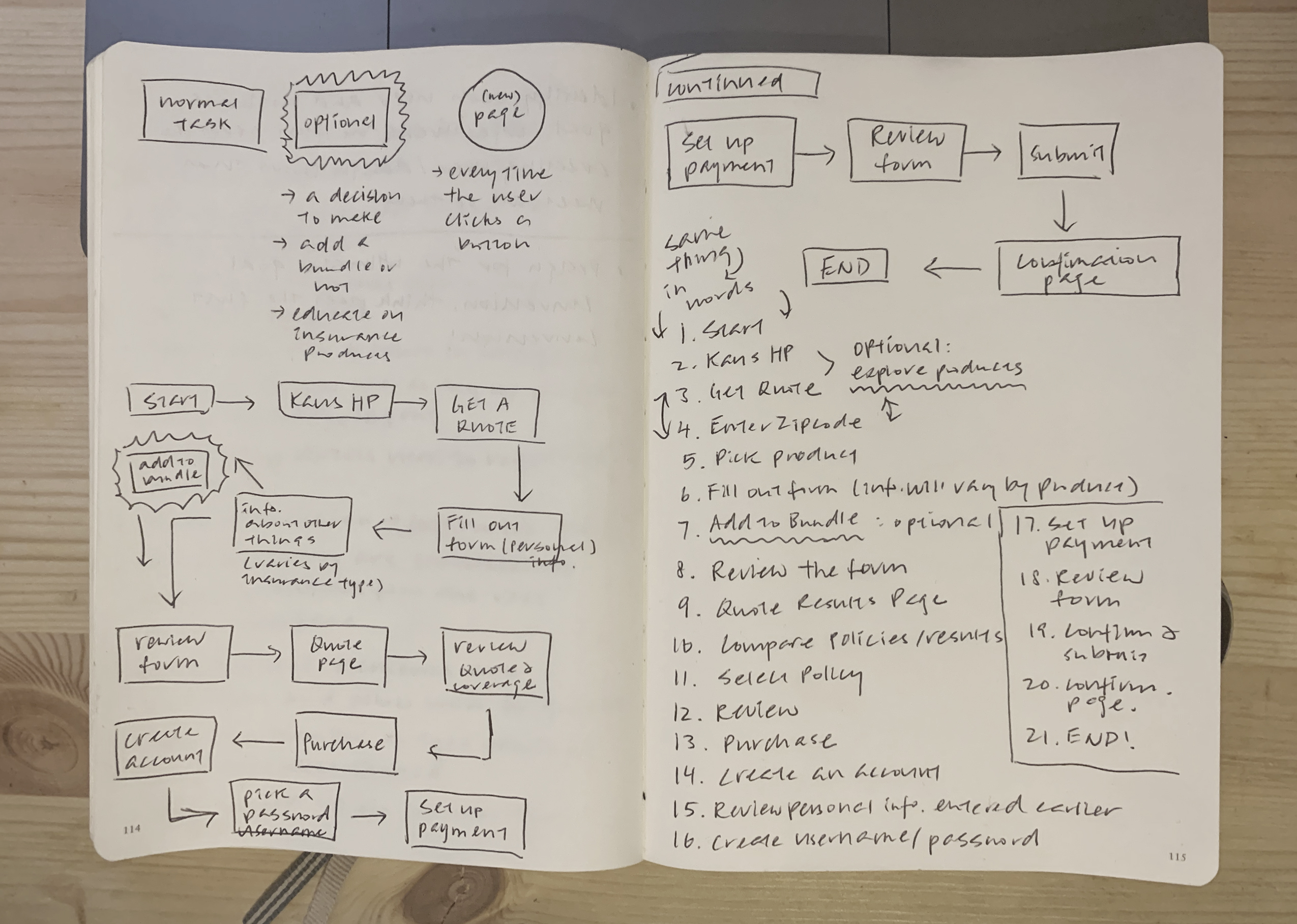
While this is generally following a happy day scenario, I have included decisions the user would be asked to make depending on their experiences with purchasing insurance products.
The reason for designing two simple 'happy paths' is because I want to make sure the features I'm designing for the website will cater to both types of users.
For the purpose of putting this on my case study, I've condensed the user flow. To see the complete and final version: click here.

After defining the problem, the users, and diving into information architecture, I was able to start building a style guide/UI kit, wireframes, and mockups for the prototype.
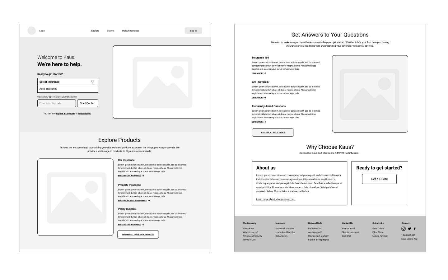
For the Kaus Insurance website, I focused on the desktop experience for users. I did do a few sketches before committing to this design. Aside from that, I also built out wireframes of how the tablet and mobile versions would look like as well.
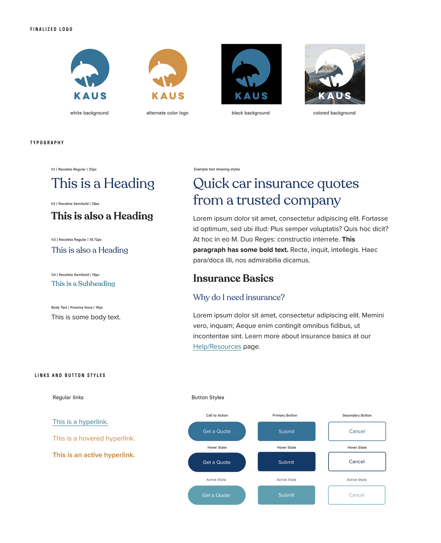
Part of Kau’s goals was to have a refreshed brand that’s modern and updated. I sketched out a few ideas and used the umbrella to signify protection.
These were the contenders and I originally wanted to use green as the primary color because it generally conveys security and trust, but I later realized it was a difficult to work with. I ended up going for the top left on row 1 because it was scalable and straightforward.

Before moving on to the prototype, it is important to set up a UI kit that includes the primary and secondary colors, typography, link and button styles, and whatnot.
This is a simplified version of a UI kit. For the purpose of this project, I only included components that I know I will be reusing constantly when building out the prototype at a later stage.
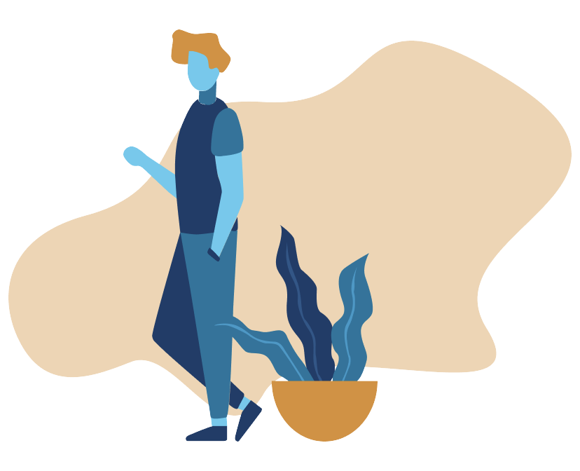
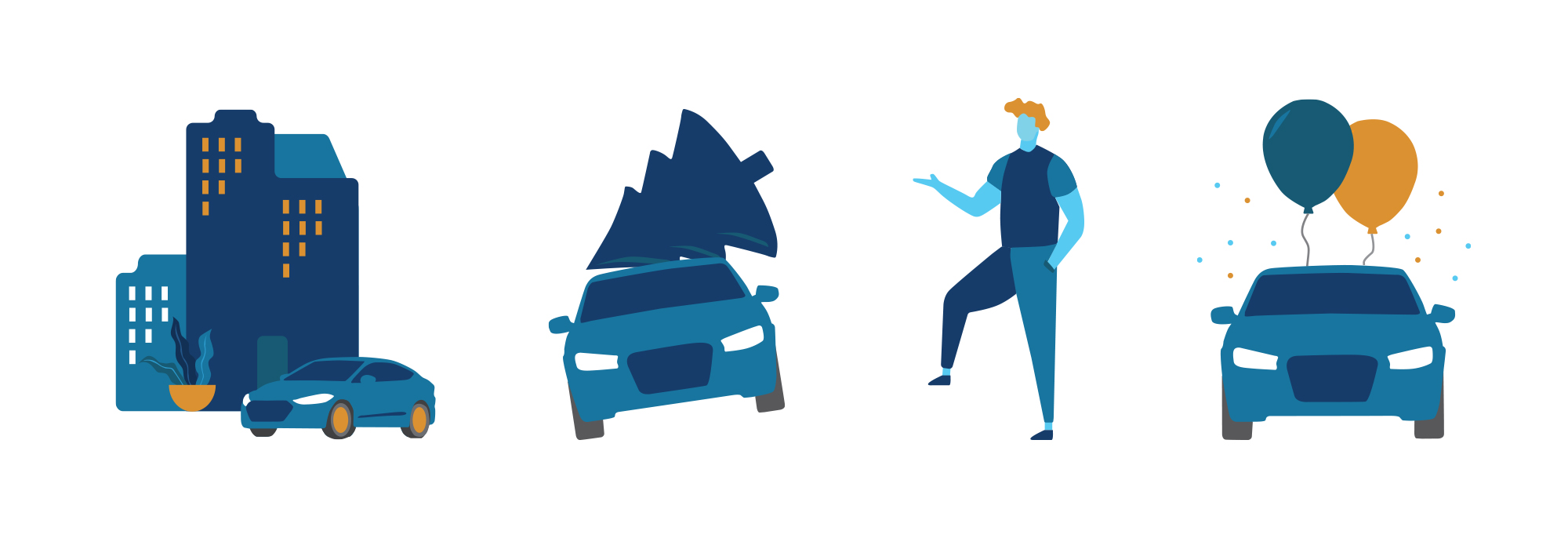
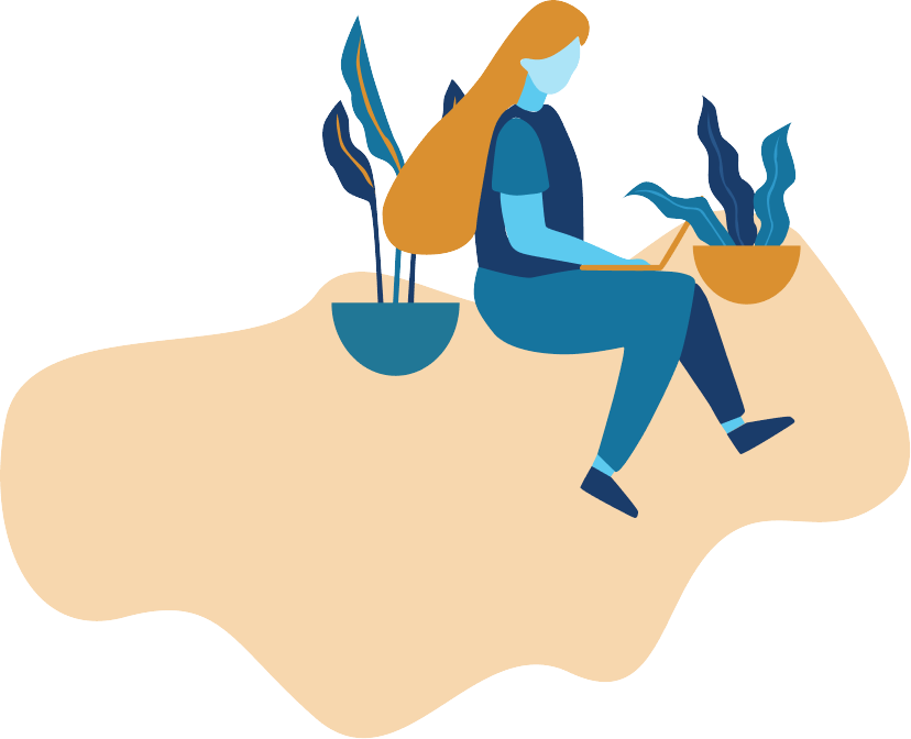
As part of a refreshed brand, I wanted to add illustrations to accompany text that tends to be really boring to read. A lot of users have voiced their opinions on the jargon and impersonal language used on insurance websites.
Hence, I decided to create my illustrations to make the process of purchasing insurance more engaging.
Before entering the testing phase, I needed to build out the prototype to be tested. I created the homepage, auto insurance page, and also the getting a quote process page because those three pages will be the main focus of the usability tests.
The final prototype is based on two main tasks: 1. getting a quote and 2. getting educated with insurance coverages.
For the prototype, I decided to change the layout of how 'What We Offer' looks like from the wireframe. Instead of having a hero image to the left, I decided to show all three of the most popular insurance policies Kaus offers. For the frequently asked questions section, I kept it as it was represented in the wireframes. I didn't want to post all the questions and answers in full-length. If a user is unsure how to start, this is where they could go.

Instead of asking the user for personal information in the beginning, I tried to ask only the essential questions first that would allow them to get a quote quickly. Some users have mentioned that they were confused as to why it was important to provide an email and phone number when all they were trying to do was get a quote.
As for the quote page, I wanted to show the prices upfront. Insurance companies have the tendency to show the slowest price first but with a lot of terms and conditions. For the quote page I designed, I wanted to make sure the user knows exactly what they are paying for and why. As for each individual coverage in the policy, I intend to include a question icon beside each so that the user can click into it to see what it entails.

Below are screenshots showing how it would look like when a user clicks on the small 'question mark' icon. In addition, I added a box to the left that would follow the user for the entire process of getting a quote. If the user decides that they need to go back to make changes, they have to option to do so.

Putting all the hard work to the test. This process consisted of devising a usability test plan. The test plan includes test goals and objectives and the mechanisms that will be used to test. Again, due to unforeseen circumstances, all of the usability tests were done virtually over Zoom or Skype.
Putting all the hard work to the test. This process consisted of devising a usability test plan. The test plan includes test goals and objectives and the mechanisms that will be used to test. Again, due to unforeseen circumstances, all of the usability tests were done virtually over Zoom or Skype.
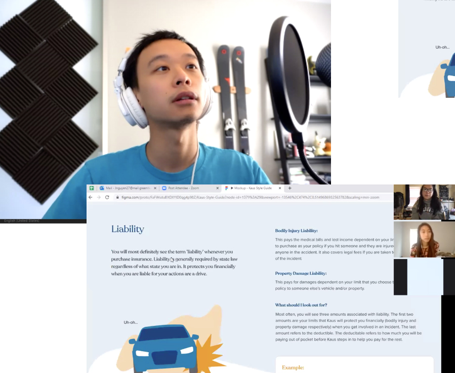
I was able to gather 9 participants to conduct Usability Tests with. I found a handful of people with experience purchasing insurance and a handful that do not. After replaying the recorded sessions and analyzing how users interacted with the prototype, I was able to create an affinity map that summarizes all my findings.
The affinity map help visualizes the feedback I gathered from the tests and would later help me make changes to the prototype.

Now that I have gone through all the stages of the design thinking process (from empathize to testing), I have learned that there might be some assumptions I think are important in the beginning but end up not being important at all. Here are some feedback I have received from the usability tests that will help me prioritize future changes.
The process doesn’t end here. In the real world, I am certain that I will be revisiting each stage of the process more frequently and utilizing rapid prototyping (test fast and fail fast). But for the purpose of this project, everything progressed in a very linear way.