
Redesigning the brand for a collegiate-level Model United Nations conference
Timeframe: 1 Year
Role: Director of Design
Projects: Branding, Promotional Materials, Handbooks
Technologies and Softwares: Adobe PhotoShop, InDesign, InVision and Dreamweaver
Deliverables: Delegate handbook and promotional materials for the conference
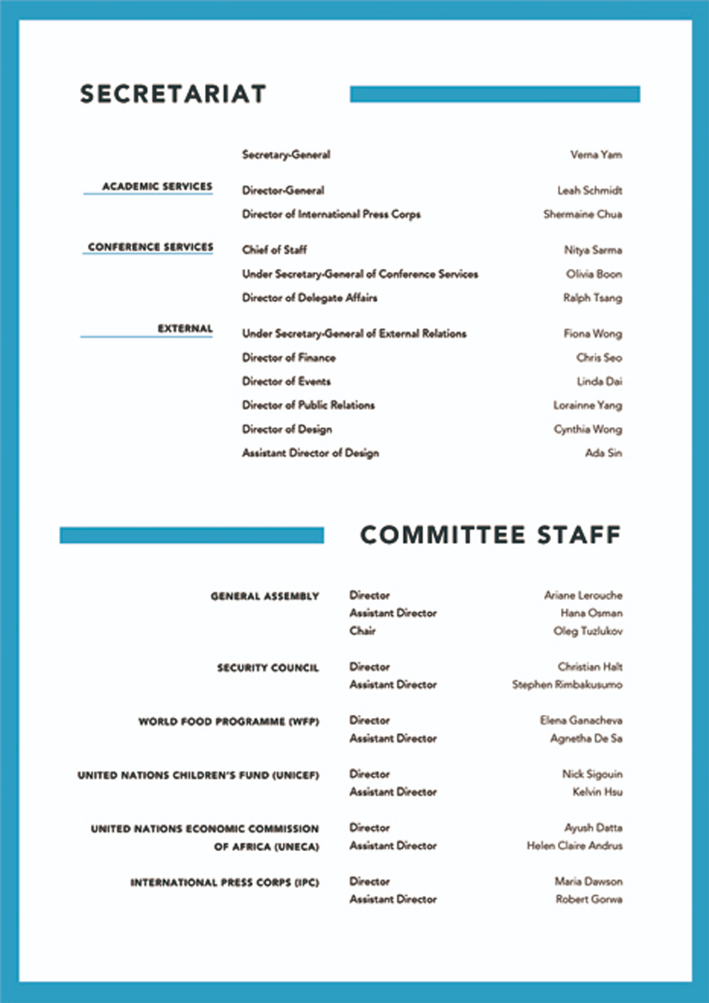
As the Director of Design, I was constantly having meetings with the rest of the 'Secretariat' team. The term secretariat is just a term used to describe the executive team that is responsible for putting the conference together. I would sketch out ideas and then share it with them.
Since they were located in Canada and I was in the United States, we were on video calls a lot to touch base and provide updates and progress.
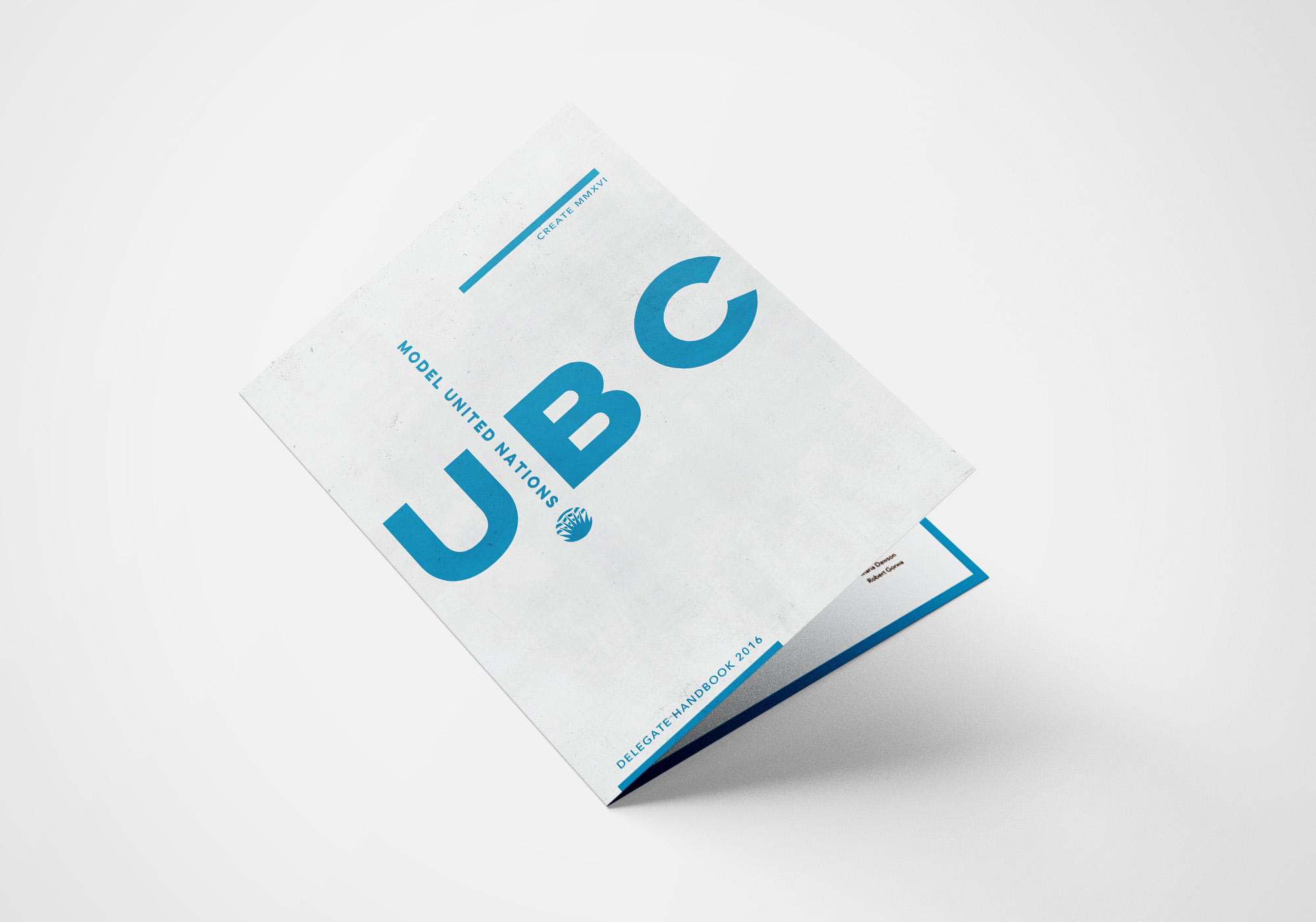
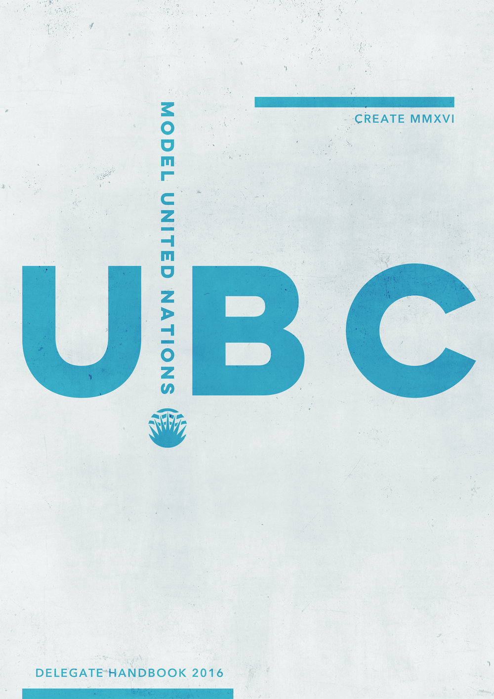
UBCMUN stands for the University of British Columbia Model United Nations. I volunteered as the Director of Design for them in 2016. My job was to rebrand the entire conference including designing a delegate handbook, digital assets for the website, and promotional materials for various social media platforms.
I volunteered my time to help them because I have been active with Model United Nations since high school. I also used this as an opportunity to practice my design skills.
I have always considered myself as a 'freelance designer' with no formal experience. But I spend a lot of time experimenting with Photoshop and Illustrator. I draw a lot of inspiration from magazines and publications I enjoy reading. I also like to have very contrasted colors (e.g. light colored text over dark backgrounds). The color palette I have chosen for this project is based on the official United Nations colors (white and light blue). The color is used to depict peace since it is the reasons why the UN was established in the first place.
I was never formally trained to become a graphic designer. A lot of the skills I have were obtained from years of experimentation and also looking at Dribbble and Behance for inspiration.
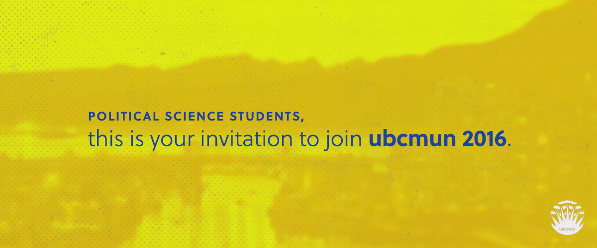
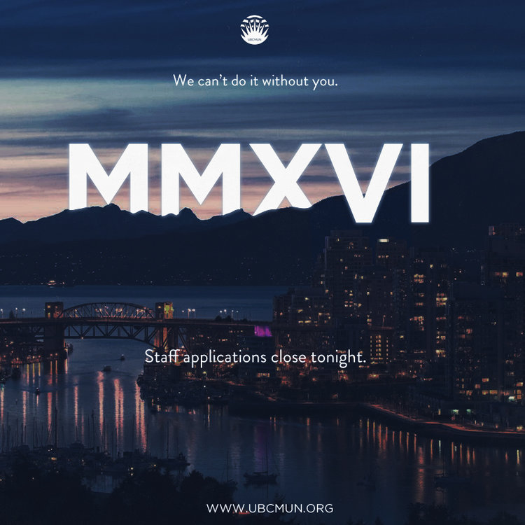
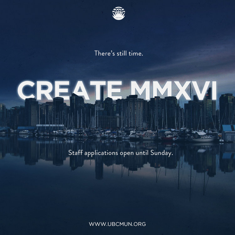
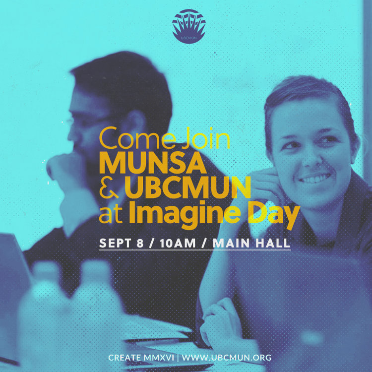
One of the most important aspects of the conference was promoting the conference through social media platforms. While the conference itself attracts about 400-500 students from all over the country, the conference does rely on attendance to ensure that it will happen again the following year. Instructed by the Director-General (a fancy term for the person that is overseeing the logistics for the conference), I made these digital assets for marketing and promotional purposes.
I wanted the colors to pop for the email blasts and promotional materials for Facebook. The square dimensions are based on how the photos used to render on Facebook and Instagram. I kept the basic color palette of blue but added a pop of gold for attention. Blue and gold also create a nice contrast. For the square tiles, I used the skyline of Vancouver because that is where the conference is held.

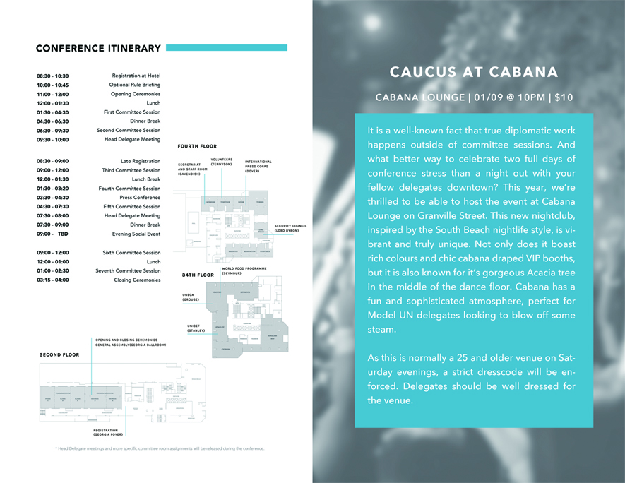
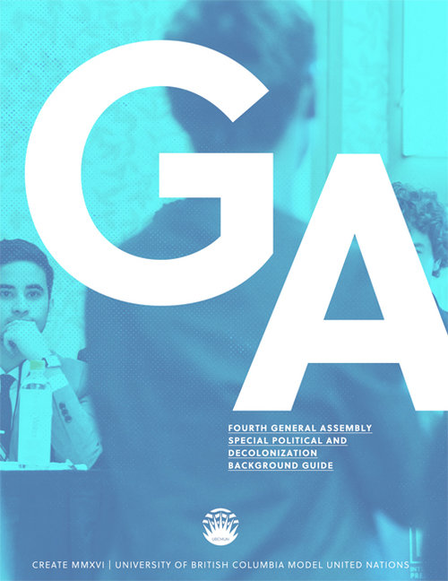
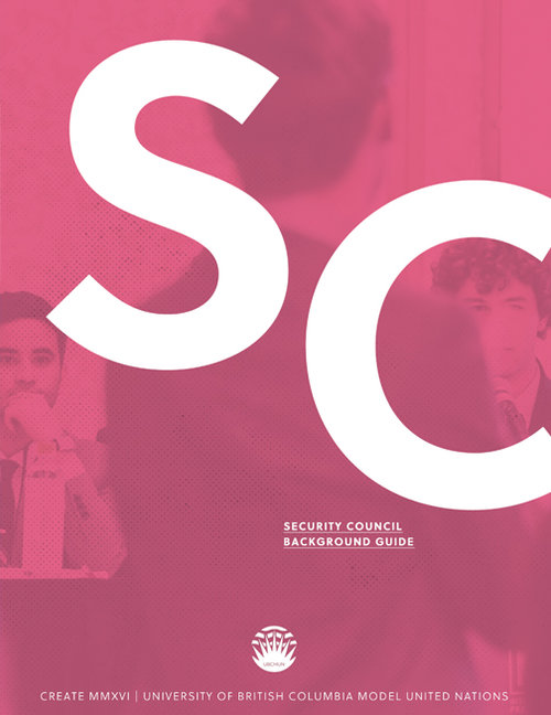
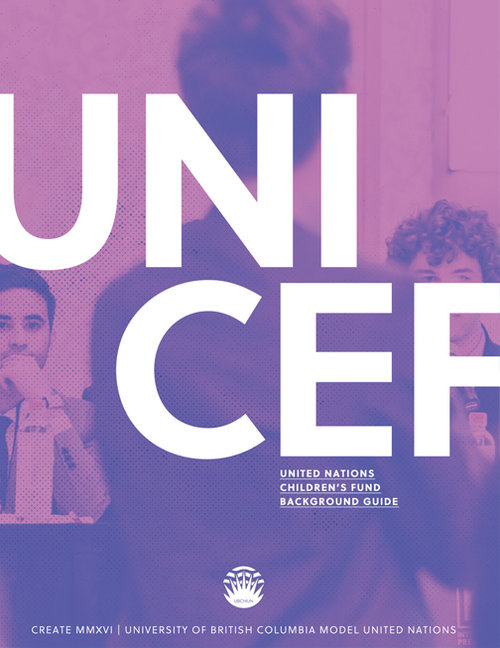
Background Guides serve as an important resource for prospective delegates and attendees because they provide all the nerdy (and exciting) topics of the committees at the conference. I remember when I was in college, I really did a book by its cover in terms that if the cover design of a book is attractive I would be more likely to pick it up and read the synopsis and summary.
When designing the background guides, I wanted them to be engaging. I also wanted each committee to be represented by a different color because each committee has their own character. In addition, it would be easier to distinguish between the committees as well.
As an amateur designer, I didn't really have a real design flow going. But instead of wanting to add too much color into the design, I wanted to simplify them.
Unfortunately, these were from an older project and so I don't have the older iterations as comparison. I really enjoy the contrast and the juxtaposition of a large text against a fade out image in the background. I like that the contrast is stark but yet subtle enough to not create too much tension.
I enjoyed volunteering for student organizations because they have proven to be a great platform to practice my design skills. While I am no expert at them and forever on a learning journey to create better designs in the future, the designs for this conference were well received. I've included this older project in my portfolio because I want to showcase some of the visual design skills I have. Part of being a UX designer is more than doing research and making sense of data - I believe having strong visual design skills would be helpful on my journey to becoming a UX designer.
In addition, I also did a redesign of the website that can be found here.