

Our team came together to find ways for Amazon to encourage more sustainability on their e-commerce platform. At the end, we named the 'program' as Amazon Go Green.
We submitted this case study as part of a design challenge from productdesign.tips. It is worth noting that this is an unsolicited design project, hence it came with a couple of setbacks: 1) lack of access to application analytics and 2) technical feasibilities.
We chose Amazon as the retailer for our challenge because it has a large potential for customer reach. It is currently the largest e-commerce retailer in the world with over 197 million users on their platform each month. As a company that holds such a sizable market share, Amazon is facing growing pressures to implement better environmental practices to offset their carbon footprint.
In the last few years, Amazon has voiced their commitment to increase sustainable practices - from their operations and supply chain down to their packaging. The question is then: how might we tap in their customer base and implement ways to promote sustainability?
Each one of us in the team were tasked to conduct some preliminary market research and we uncovered some interesting statistics.
We also looked at other retailers to see what practices they were implementing to promote sustainability.
Most of these companies had recycling programs, allowing customers to bring in used items.

Based on our research, we found 3 key insights. Most of our interviewees:
Everyone on the team were tasked to conduct one user interview - that gave us a sample size of 5 current Amazon users. Based on their answers, we were able to create 'Michelle' - a marketing manager based in Austin, Texas.

After our user research synthesis, we were able to confirm our assumption that most Amazon shoppers do not purchase clothing. They tend to buy household and body products that came in a variety of plastic bottles. Many Amazon shoppers also do not recycle those bottles due to inconvenience or the uncertainties around how to recycle the right way.
After the research phase, we were able to narrow down and define the 'how might we' statement - how might we design checkout screens that would help educate Amazon shoppers about items that are eligible for recycling and incentivize them to recycle?
Yes, we are essentially trying to answer two questions but we were curious whether having some sort of incentive system would help enable users to recycle. But before we move on to testing, there is much work to be done. We created a user journey map for Michelle, our persona, to better understand her needs and pain points.
Since we recognized the inconvenience that customers face when they are left to recycle on their own, the goal for Amazon Go Green would be to collect bottled products from customers in exchange for Amazon points, which can be redeemed for rewards. In this exercise, we are able to delve into Michelle’s feelings, motivations, and emotions throughout each touchpoint in her journey.

While analyzing each of the interactions, the following insights were used as references to help guide us through our research planning.
Once we gathered enough insights from our user journey map, we were ready to map out a couple of user flows that would illustrate the two main tasks our users would need to accomplish.
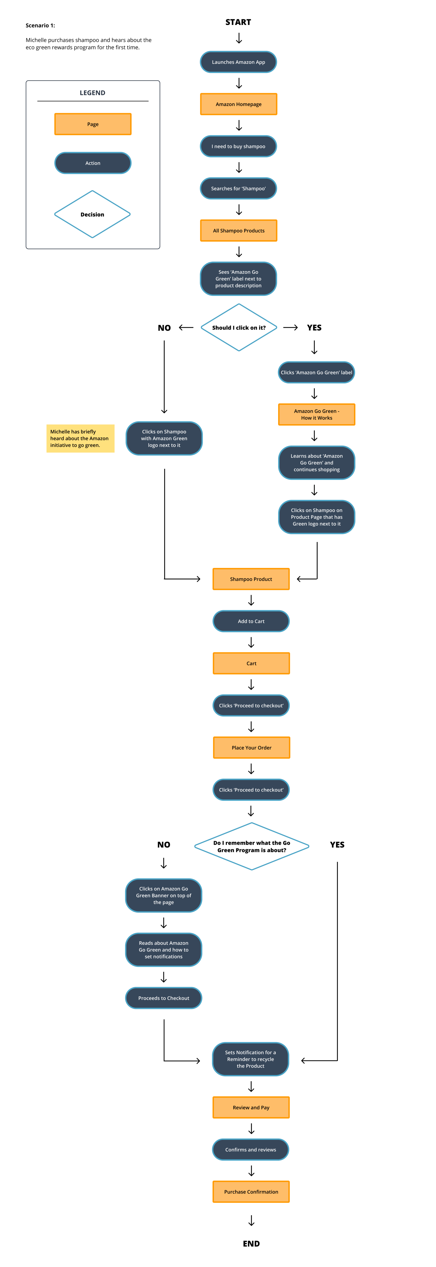
For scenario 1, we were able to map out the flow with all of the pages necessary for Michelle to successfully accomplish the task at hand. This is when we were able to visualize and consider all possible turning points.
For scenario 2, we took a look at where we needed to establish a simple and feasible way for a user to feel incentivized to recycle a product. Our solution was for Michelle to be able to view her points, see the rewards she could get from recycling and then obtain a QR code for when she goes to the desired drop-off location

Based on the user flows, our team conducted a Crazy 8 Ideation and selected four features from our sketches that would best solve the challenge statement. Instead of having one person do a standalone Crazy 8 ideation exercise, we were all tasked to sketch our own Crazy 8's that we ended up sharing on a Zoom session to discuss which ones would make it to the prototype phase.
I didn’t spend a lot of time really exploring the different layouts through sketches. I opened up Figma pretty quickly and started building wireframes on it. I wanted to focus more on the ordering and payment process than the homepage. It was still worth exploring options though.
The new logo would retain Amazon’s branding and remain simple. We thought the additional smile over the logo captured the essence of the recycling program.

Based on all of our interviewees, they agreed Amazon’s return process was easy. The steps had some similarities to what Amazon customers are familiar with, so incorporating recycling would be feasible with their existing shopping habit.

We thought it would be best to have a reminder to set the date to recycle, placed on the cart screen. We also discussed there should be another place in the app where the customer can change the date to recycle after the product is purchased.

This screen would capture reward points already earned and currently pending to recycle. We thought this page could be the initial place to start the recycling process back to Amazon.

Our team started building the high-fidelity designs for the features of the Amazon Go Green Program once we finalized the user flows and picked out the features we wanted from the Crazy 8's ideation. Our goal was simple: build a seamless flow that would guide the user to learn more about the new program and encourage them to recycle used bottles.
What's great about working in a team is that building out the screens for testing was a lot quicker. Since we had 5 team members, we divided the workload so that each one of us would focus on building screens for a specific task. I was tasked to build out the incentives screen and the QR code page aka the Amazon Go Green page where shoppers would be able to access information on the points they have earned from the Go Green program.
Building the screens was not a daunting task as our team simply cut and pasted the current screens of the Amazon app and replaced components with our own.

After finalizing the prototype, we designed an unmoderated usability test on Maze. We came up with a usability plan that would allow us to test the main features of the Amazon Go Green program and how well the integration would look and feel with Amazon's current interface.
I was tasked to write up the usability testing plan before we sent out the link to multiple Slack channels, social media groups, and friends.
We knew we wanted to test our high-fidelity prototype of the Amazon app. Due to the short timeframe of the design challenge, we decided it would be easier to do an unmoderated usability test through Maze.
Our goal was to have at least 10 participants. We ended up having 15.
Based on the research we've done, we came up with two scenarios for testing.
Scenario 1 — Imagine that Amazon has launched a new recycling program called Go Green, which encourages you to recycle plastics you purchase from their website. How would you learn more about Amazon’s Go Green Program & add the eligible item to your cart?
Scenario 2 — Now that you’ve purchased an Amazon Go Green eligible item, you want to check your rewards status and see how to return your items. How would you do that?
According to the heat maps, testers were able to identify the “Amazon Go Green” label that would provide more information about the program.There was confusion regarding the second task, mostly regarding the buttons on the rewards page, the initial flow of recycling the product, and the wording of the tabs of relevant products that have been purchased.
Also, what's great about Maze even though it's an unmoderated usability testing is that it has a heat map feature that shows you where participants are browsing (aka hovering over and clicking).

One of our teammates, Lena, built out a comprehensive affinity map, showcasing the key insights to how well our users have fared while completing the tasks.

From the Maze test, we were able to collect data to flush out a list of observations and insights that would potentially help us shape our final prototype.
We focused on revitalizing the Go Green program by reallocating certain buttons and giving the program a section of its own, similar to Amazon’s Fresh. This would make it easier for users to navigate the recycling program and track rewards, ultimately helping to distinguish it from the rest of the platform.
View Final Prototype
This design challenge allowed us to think more deeply about sustainable practices and how it can be better integrated in e-commerce apps, particularly with a large retailer such as Amazon.

While we were unable to send this up to Amazon to get real results, we did end up getting second place for the design challenge. For newbie UX designers like the five of us, I say this was quite an accomplishment for us.