

Kaus is an insurance company with more than 30 years of experiences. This year, they are planning to tap into a more digital-based approached to sell individual insurance that appeals to a younger audience.
Kaus has a wide range of insurance policy offerings and would like to prioritize in providing easy solutions for customers, allowing customers to customize their policy choices, and a refreshed brand.
Disclaimer: This was completed as part of a Capstone project for DesignLab. Kaus is a fictional company. You might see other people with this project in their portfolios.
Kaus understands that buying insurance can be a very frustrating process. Aside from wanting a refreshed brand, they also want to come up with solutions for people to purchase insurance.
The problem I was trying to solve was how can we design a website that will not only educate users on buying insurance but also have an easy and quick way to look at coverage and quotes?
To get started with the project, I did some market research and competitive analysis. From this, I was able to look at how other insurance companies have designed their websites. I was particularly interested in learning about their process of getting a quote and they would explain common scenarios when insurance might be needed.
In addition to market research and competitive analysis, I wanted to talk to actual people to gain more insights about how they purchase insurance. From that process, I was hoping to unearth some of the pain points.
Kaus was hoping to join other insurance companies for a better online presence and start selling policies online. I looked at other existing insurance companies to gauge how their process differed.

All of the 8 participants I interviewed owned a car and most of them are currently renting an apartment with health insurance already offered through work.
After synthesizing the research I did in the empathize phase, I created ‘Jessica’ - she represents the most common findings. When piecing together the persona, I looked for patterns in the goals, needs, pain points, frustrations, motivations and wants of the users I interviewed.


Referring back to the research I did, I took a closer look on what problems we were trying to solve and who we were solving problems for. Through a card sort and synthesizing the data collected, I was able to move to the next phases and began to define user flows, create a task flow and define a site map as well.
A card sort was helpful when I was trying to find out how people might sort information regarding the types of coverages and what insurance is. I chose to focus on these two things because they were the most common features users wanted to see based on the interviews.
I opted for a hybrid card sort because I wanted to give the users the flexibility to create their own category. I kept the cards and categories general but hoping to still be robust enough to cover most use cases.

While the card sorting was somewhat useful in helping me create the site map. The fact that people were confused what a card sort is (I had to do it virtually due to COVID-19), I felt I wasn't able to truly understand what they were thinking while completing it.
After the card sort, I sketched out the 'happy day' scenario. This is based on the research I have conducted and also looking at competitors’ websites as well.
If I had the chance to conduct interviews again, I would most probably have the user show me how they would purchase insurance.


The user flow is based on two scenarios (based on different entry points). While this is generally following a happy day scenario, I have included decisions the user would be asked to make depending on their experiences with purchasing insurance products.
The reason for designing two simple 'happy paths' is because I want to make sure the features I'm designing for the website will cater to both types of users.

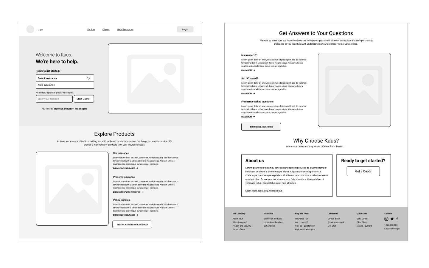
After defining the problem, the users, and diving into information architecture, I was able to start building a style guide/UI kit, wireframes, and mockups for the prototype.
For this project, I focused mainly on the desktop experience. It would have been nice to also build out a mobile experience as well but due to time constraints, I only did the desktop designs.
I started out by building basic wireframes before moving on to high-fidelity mockups. This gave me a good idea of where sections should be located.
I sketched out a few ideas and used the umbrella to signify protection.
These were the contenders and I originally wanted to use green as the primary color because it generally conveys security and trust, but I later realized it was a difficult to work with. I ended up going for the top left on row 1 because it was scalable and straightforward.

For the purpose of this project, I only included components that I knew I would be reusing constantly when building out the prototype at a later stage.

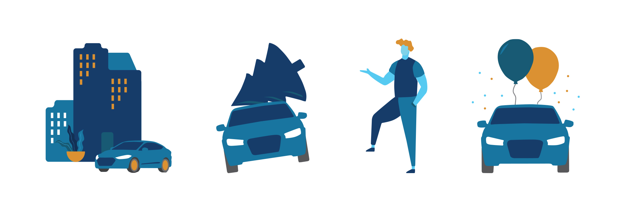
I went above and beyond and wanted to include fun illustrations that would help elevator an otherwise, dry process to purchase insurance. I thought adding these illustrations when trying to explain a complicated concept would be helpful.
As I geared up for the testing phase, I needed to build out the prototype. Since time was limited, I only focused on testing out the homepage, auto insurance overview pages and the getting a quote page.
When building out the prototype, I based it on the user flow I created. How can the user feel confident about getting educated with insurance coverages and moving forward with getting a quote?
I really wanted to inject elements that would appeal to the younger audience. The design I opted for was inspired by current web design trends (I used Dribbble and Behance for design inspiration). An eye-catching and minimal landing page tends to be the way to go now as far as web design trends.

Instead of asking the user for personal information upfront, I decided to only ask essential questions first that would allow them to get a quote quickly. Some users have voiced the confusion as to why it was important to provide an email and phone number when all they were doing was shop around for the lowest rates.
For the actual quotes page, I wanted to show prices upfront as well. Insurance companies have the tendency to show the lowest price first but with a lot of hidden terms and conditions. My designs aimed to get rid of dark patterns like that. For each individual coverage they selected for their policy, I included a tooltip (question mark icon) so they could quickly have their questions answered.

There are the screenshots showing how it would look like when a user clicks on the small 'question mark' icon. In addition, I added a box to the left that would follow the user for the entire process of getting a quote. If the user decides that they need to go back to make changes, they have to option to do so.

Putting all the hard work to the test. This process consisted of devising a usability test plan. The test plan includes test goals and objectives and the mechanisms that will be used to test. Again, due to unforeseen circumstances, all of the usability tests were done virtually over Zoom or Skype.
Due to COVID-19, I had to conduct moderated usability tests remotely. I opted for Google Hangouts, Skype or Zoom sessions with the participants and have them share their screen with me.
I was able to conduct usability testing sessions with 9 people. This being my first time doing a usability testing, I feel like much could be learned from it such as have better questions prepared and also asking more about their stream of thought while completing the tests.
I was able to gather 9 participants to conduct Usability Tests with. I found a handful of people with experience purchasing insurance and a handful that do not.
After replaying the recorded sessions and analyzing how users interacted with the prototype, I was able to create an affinity map that summarizes all my findings. I like using affinity maps to represent the results visualizing as it allows me to group similar concerns (and wins) together.

After the usability tests, I made minor changes to the prototype. A few things were just because it was my first time using Figma so the interactions weren't fully represented.

Now that I have gone through all the stages of the design thinking process (from empathize to testing), I have learned that there might be some assumptions I think are important in the beginning but end up not being important at all. Here are some feedback I have received from the usability tests that will help me prioritize future changes.
The process doesn’t end here. In the real world, I am certain that I will be revisiting each stage of the process more frequently and utilizing rapid prototyping (test fast and fail fast). But for the purpose of this project, everything progressed in a very linear way.