From 2015 to 2016, I served as the Director of Design for the University of British Columbia Model United Nations (UBCMUN) conference. One of the projects I undertook was to redesign the website. This also served as a project I worked on as part of the part time UX Design Course through General Assembly. Below is a simplified overview of how I approached the project and the processes I undertook.
This was one of my first encounters using a UX design process to design a website. I've included this in my portfolio to showcase how I got into UX design. Looking back, there are so many things I would love to redo.
Timeframe: 2 months
Role: Director of Design
Projects: Design a brand new website
Technologies and Softwares: HTML, CSS, Dreamweaver, InVision, Adobe PhotoShop
As the Director of Design, I was constantly having meetings with the rest of the 'Secretariat' team. The term secretariat is just a term used to describe the executive team that is responsible for putting the conference together. I would sketch out ideas and then share it with them,
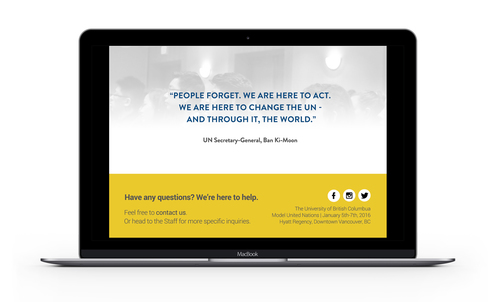
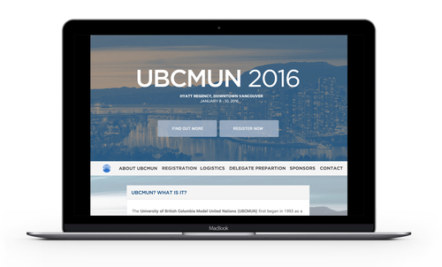
UBCMUN was established in 1993 as a pilot project of the International Relations Student Association (IRSA) at UBC. It has grown from a small conference to one of Western Canada's largest collegiate Model United Nations. It draws delegates (students) from all over the world. Beginning its roots on the UBC campus - it has now found its home in Downtown Vancouver.
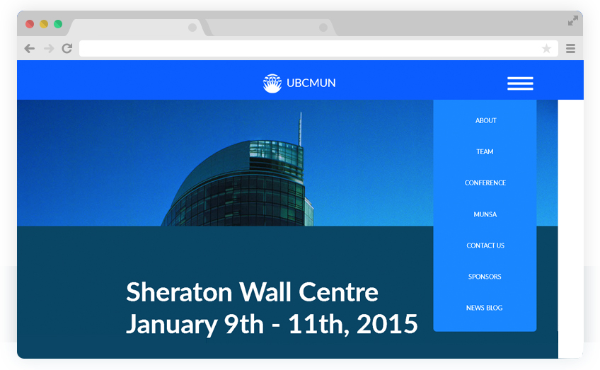
Out of the user interviews and the survey I put online, a lot of users voiced their concerns about the navigation and how the information is organized. Hence, my goal is to redesign the navigation and also include information that users want to see. I want to be able to create a website that aims to delight the user and provide information for current and prospective conference attendees.
I sent out a link through social media and gathered more information how users might interact with the current UBCMUN website. I wanted to gather specific information about the current design since I did not really have time to conduct user interviews with a wider audience. I was able to interview 5 users.
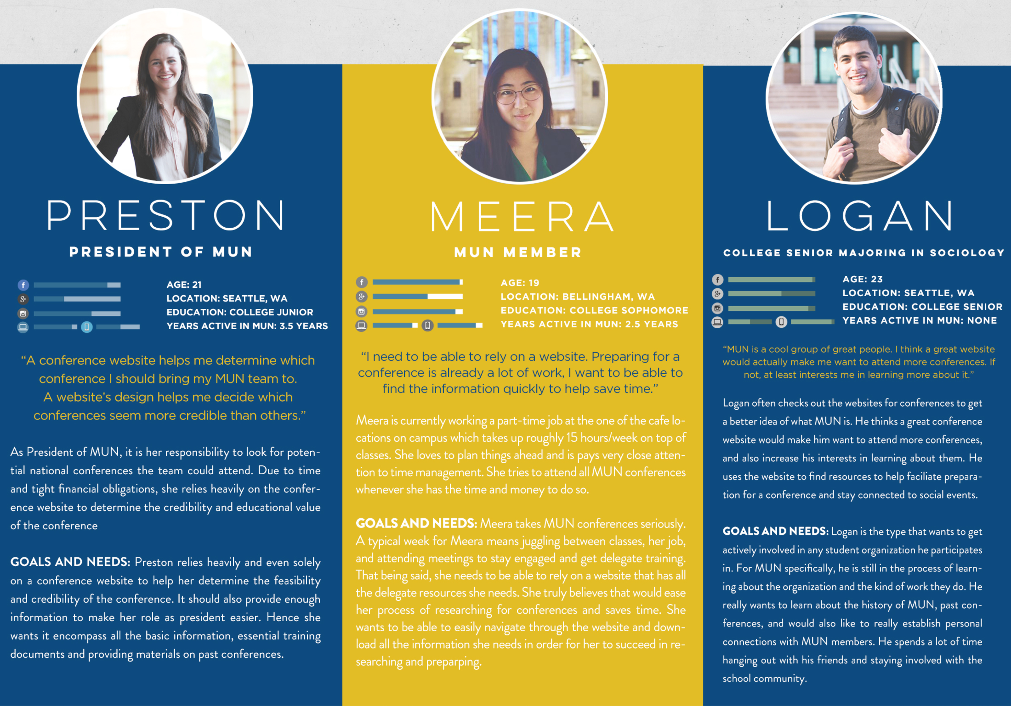
When I was taking the UX course at General Assembly, my instructor noted that it would be important to identify the different types of users: the power user, the regular user, and infrequent user.
Based on the user interviews, I created three personas based on the different users I defined above. If I had the chance to redo the personas, I would definitely focus on one or two personas. That way, I will be able to explore each persona in more detail. I would call the personas created for this project more provisional.
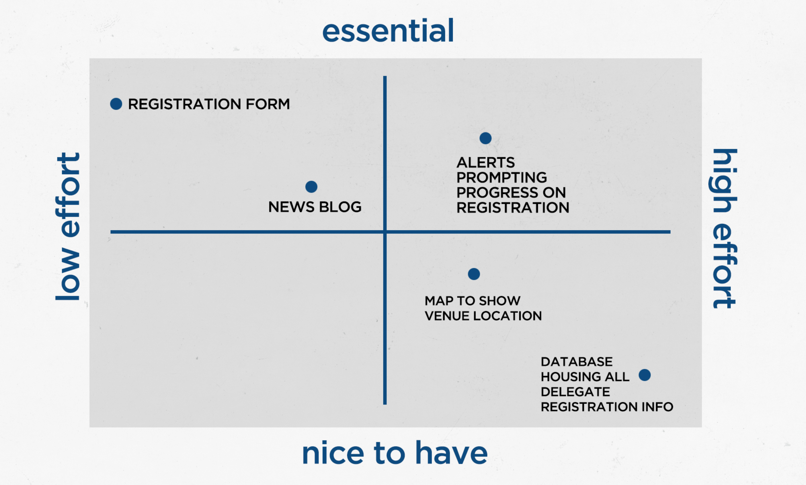
From the quick user research I did, I came up with a list of solutions and features that are not already included on the website that I could potentially explore as new features.
After defining the problem and the users, I moved on to crafting a content strategy. This will later help me with feature prioritization and moving into defining the structure of the website while exploring the information architecture of the website.
The objective of the website was simple: to build a website that showcases information about what MUN is and how UBCMUN can act as a learning platform to help elevate participants' leadership experiences, public speaking skills, and establish an international network with likeminded individuals. Below, I have shortlisted a few features that must be included in the redesigned website:
The UBCMUN website is more than just a platform for information. It also should provide information and features that would trigger prospective students to want to register for the conference.
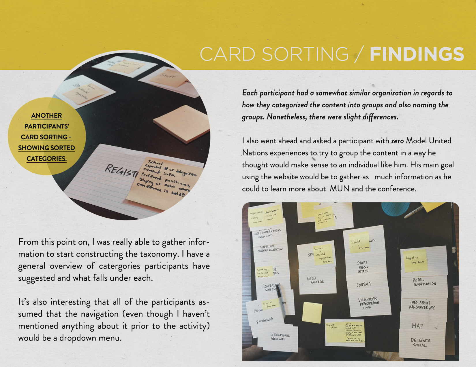
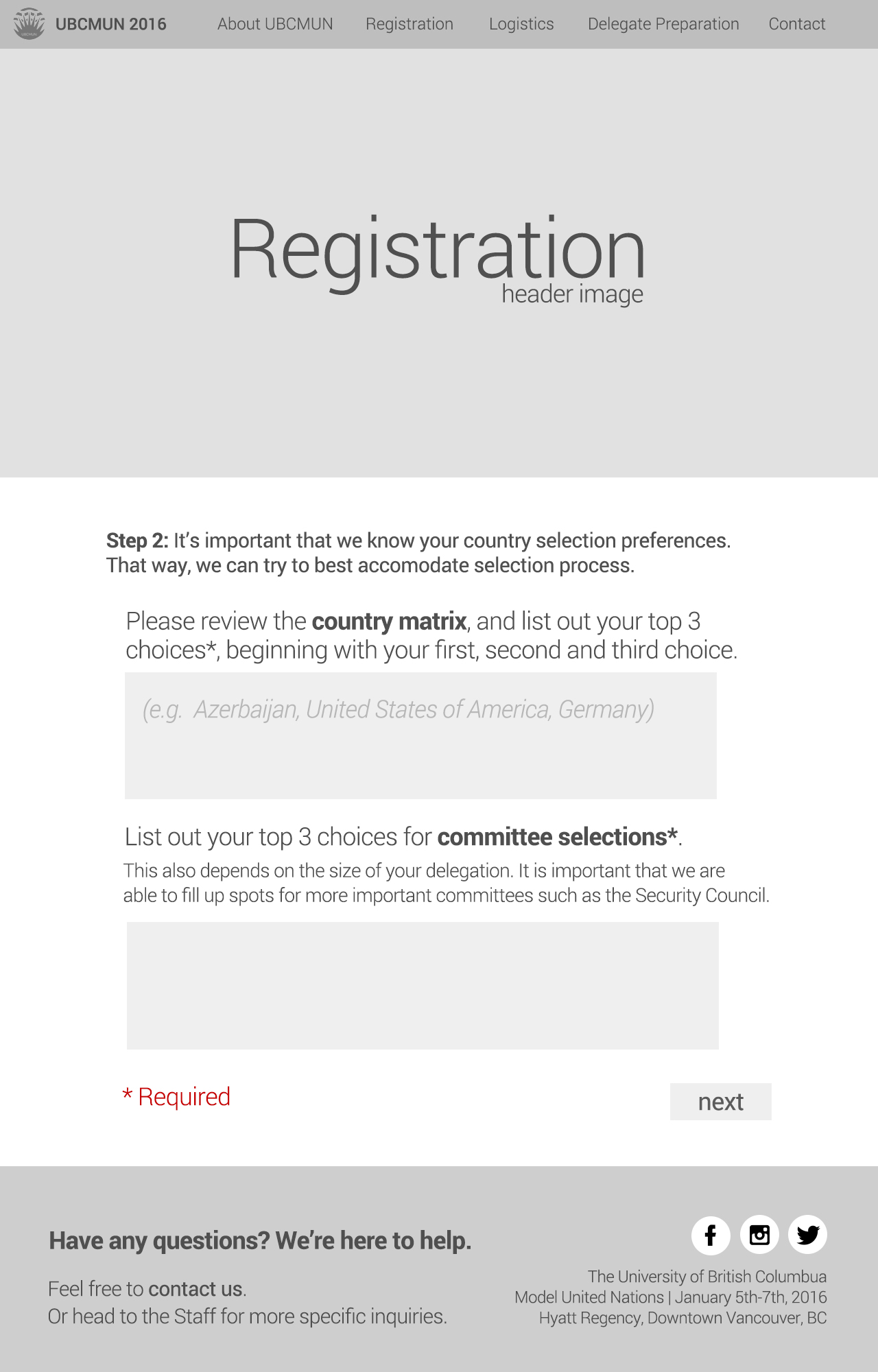
To explore how information should be organized on the website, I opted to do a card sort with several users. I wrote content on individual index cards so participants could easily change and sort the order of the cards. I also used Post Its so that the users can define categories that made sense to them. Moreover, users also had the flexibility to create sub-categories to their own liking.
I suppose present day Cynthia would call this an open card sort since I didn't have any predefined categories for them. Also, I don't have the original photos of the card sort so I have included a page straight out of the process book (aka case study) I did at the end of the project.
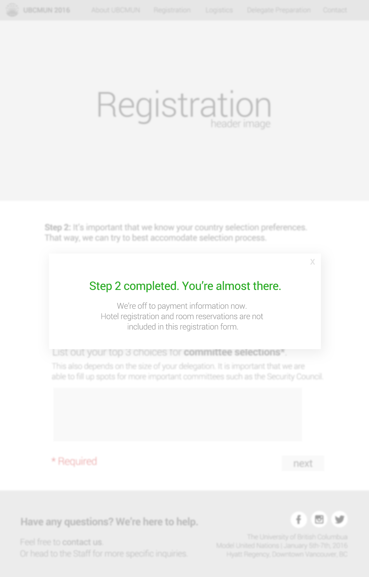
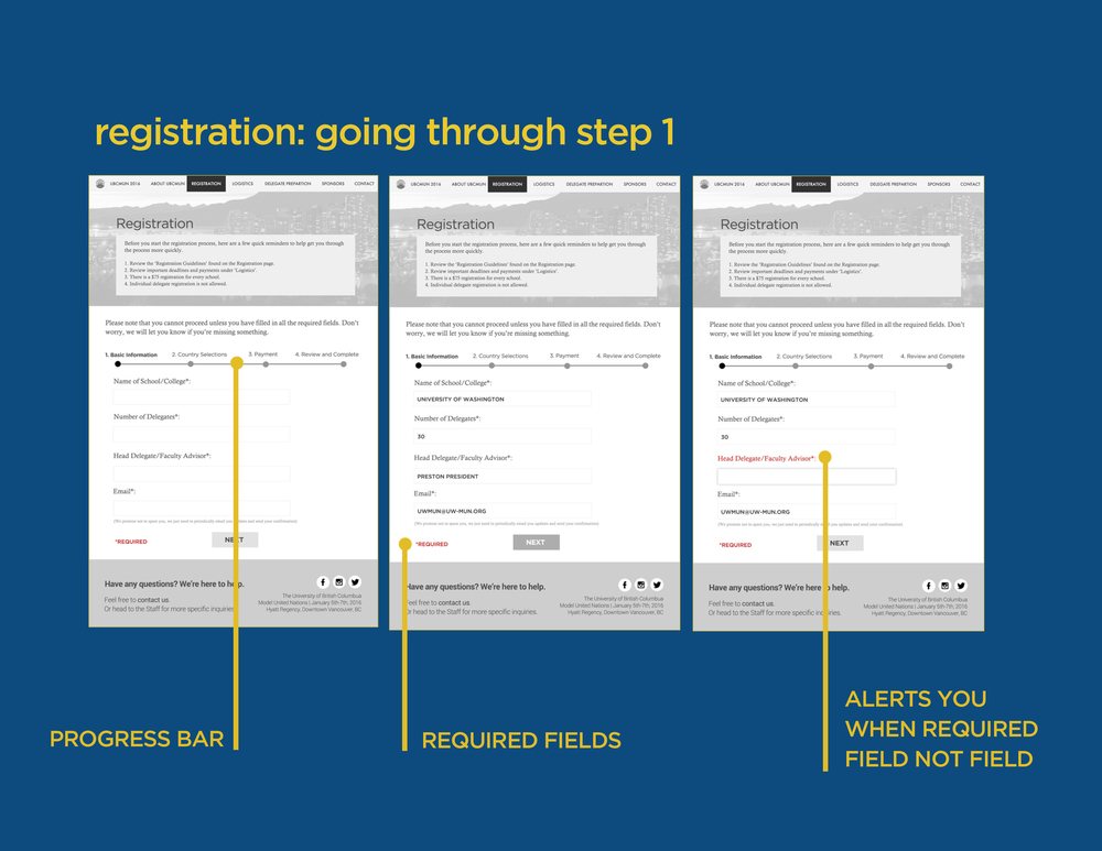
For this phase, I created wireframes, a very simple style guide, and also explored user flows.
In the beginning, I did my wireframes in Omnigraffle. It was a great tool because I got import preexisting shapes and graphics. Wireframes weren't meant to look nice but I found it difficult to snap the shapes and position them the way I wanted them to be. So I just used Photoshop to build out the wireframes in the end.
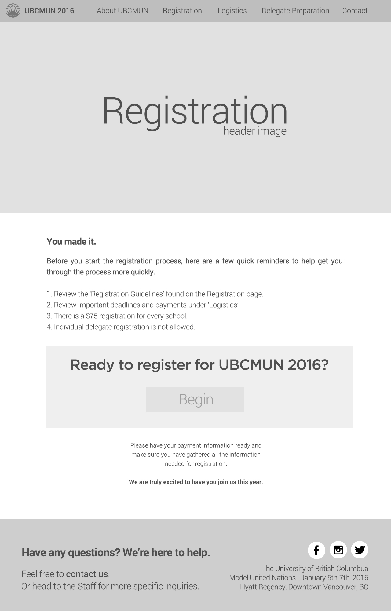
A lot of these wireframes are pretty cringeworthy. I also no longer have the original files anymore so I can't really look back to see how I made them. In 2016, I didn't know Figma existed or let alone a free and reliable wireframe tool. Nonetheless, these were the first wireframes I have ever created. I even documented them to show how the flow would be for each screen.
I wouldn't even call this a prototype. I didn't do any testing with the design. I went back to the secretariat and shared my designs and got an OK to go forward with the design. Up until today, I don't actually know whether this was a successful design or not. All I know is that people did enjoy the branding for the conference.