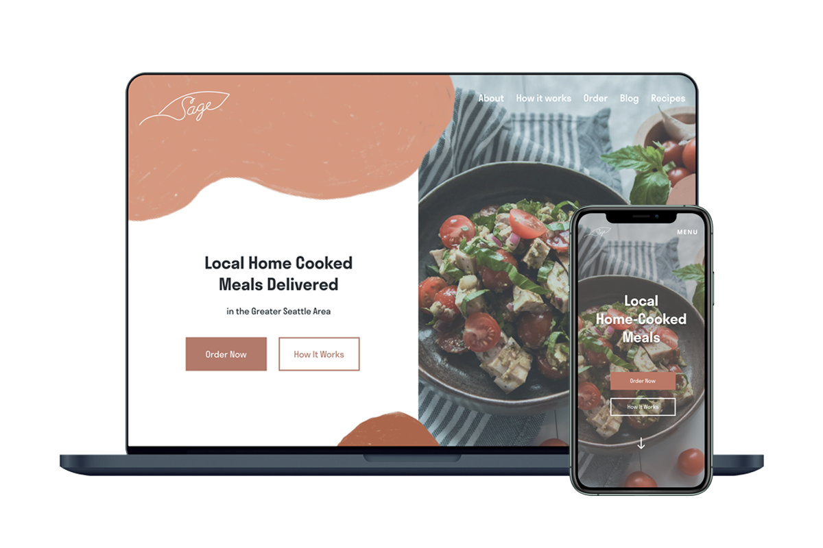
Sage is a local meal delivery service that aims to deliver ready-to-go cooked meals right to their customers’ doorsteps. It is currently owned and operated by Carrie, a former cook and chef at a local catering company.
As the company continues to grow, she wants a quicker way to update weekly menus, take orders and payments from customers. In addition, she wants to have a responsive website that would provide a seamless ordering process for the user and also give them an opportunity to learn more about Sage.
Client: Carrie, owner of Sage
Timeline: 80 hours over 4 weeks
Tools: Photoshop, Illustrator, Figma
Deliverables: Responsive website
For this project, I went through the design process. I had 4 weeks (~80 hours) to complete this project. I kickstarted the project with the empathize phase and then proceeded to defining the users. After defining the users, I started the ideate process and finally moved on to prototyping and testing simultaneously.
In this phase, I kickstarted the project by conducting market search to look at the current trends of meal delivery services. I opted for a quick competitive analysis to look at some direct competitors that are also located in the Seattle area. I then moved onto gather more specific insights through a survey and user interviews. After that, I was able to create a persona and also include features that are deemed most important for this project.
To kickstart the project, I did some competitive analysis to see how other companies are thriving by looking at the pros and cons of their website. Once I had a general idea, I went ahead and sent out a survey to gather quick data on how users pick and choose meal plans. Lastly, I conducted several user interviews as a primary way to uncover the user's personal experiences when it comes to a meal delivery service.
Many meal delivery services have an emphasis on specialty meals and dietary restrictions. With the rise of electronic ordering of grocers for pick up and delivery and online sales of grocery items from e-retailers and major grocery stores, meal deliveries have exploded over the past few years.
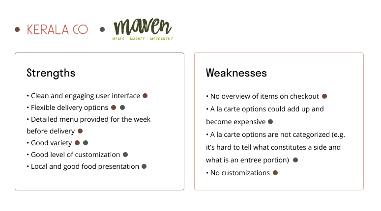
On top of the market research, I looked at two different Seattle-based local meal delivery services. Below is a summary of strengths and weaknesses from both. Both Kerala Co. and Maven are local to the Seattle area. Hence, I listed them as direct competitors.
I got a total of 17 responses from the survey. The respondents’ age range from 23 to 54 with the majority (15 out of 17) being between 25 to 35.
I conducted 4 user interviews. All four interviewees had experiences using HelloFresh. Price seems to be the most important factor for when people are choosing a meal delivery service.
After doing the initial research on the users, I created Hayley. The majority of the users that I interviewed and survey are between the ages 23 to 35. I also listed out the goals and needs and pain points that I can refer to as I move along the phases.

After conducting user interviews and gathering feedback through the survey, I am able to outline more defined features and create a user flow that are best suited for this project. I only have a timeline of 4 weeks to complete this project. Hence, it was important to prioritize what features to add onto the responsive website.
For the redesign of Sage, I decided that it wasn’t exceptionally crucial to have a lot of features. Here is the list of the features I ended up building out. Since I only had 80 hours (~4 weeks) to work on this project. I wanted to make sure I am prioritizing the features.
Important: Menu Options
The menu will be presented with pictures so that people can get a general idea of what they will be ordering. According to the interviews, this was a preferred method
Important: Dietary Restrictions Selections
Although the majority of the users do not have any dietary restrictions. I did have a user that would do intermittent fasting. It would be a good feature to have in the case that someone does have a dietary restriction.
Important: Integrated Payment within Website
When I first started this project, Carrie (owner of Sage) didn’t want to pay a fee for an e-commerce website. I initially had this as a ‘nice to have’ but after conducting a few usability tests. I find it super important to include it as part of the website.
For the purpose of the case study, I have condensed the user flow and it goes vertical and horizontal now. This differs from my original user flow as that one showed how users might explore the website.
The flow here shows how might a user order a meal from Sage.

After defining the important features that must be implemented and also defining the user flow, I moved on to sketching out wireframes and looked at how various sections and pages would seamlessly sync up with the others. I explored a few different options here.
I didn’t spend a lot of time really exploring the different layouts through sketches. I opened up Figma pretty quickly and started building wireframes on it.
I wanted to focus more on the ordering and payment process than the homepage. It was still worth exploring options though.

If there's one lesson I learned from this project, it would be to spend more time sketching while exploring the different layout options. I quickly realized that because I wanted to focus on the ordering process and due to the fact that I only had about 80 hours to work on this project, I switched gears to focus on the mobile version of the Sage order and payment pages.
Below is the first version of the high-fidelity wireframes. I'm not entirely sure what I was thinking but I opted for an 'infinite scroll' for the ordering page which I quickly changed my mind on because it simply did not make any sense to the user experience.

The second round of iteration included having each step on a new screen. I also added a progress bar that lets the user know where step they are currently on.

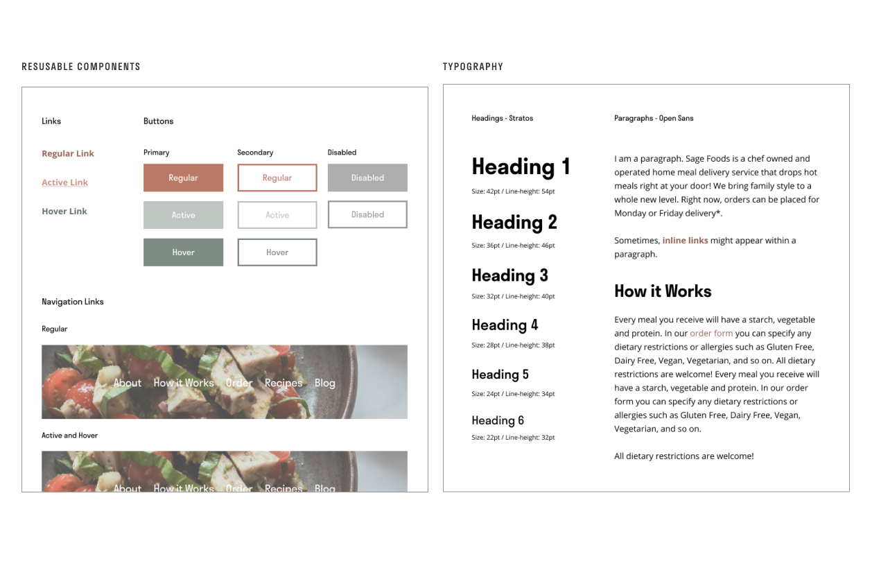
My original plan was to get testing early and go ahead and test with the wireframes I built out. But I ended up building out a style guide so I thought I might as well create a high-fidelity prototype and send that out for testing.
The goals of this project is not to rebrand Sage so I focused on only creating components that would help elevate the prototypes while conducting usability tests.
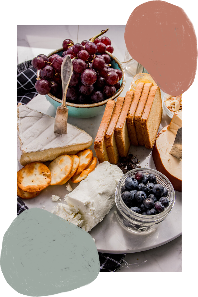
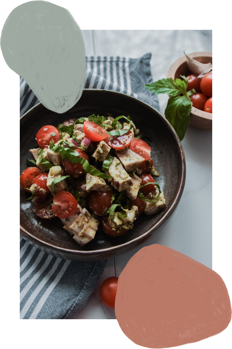
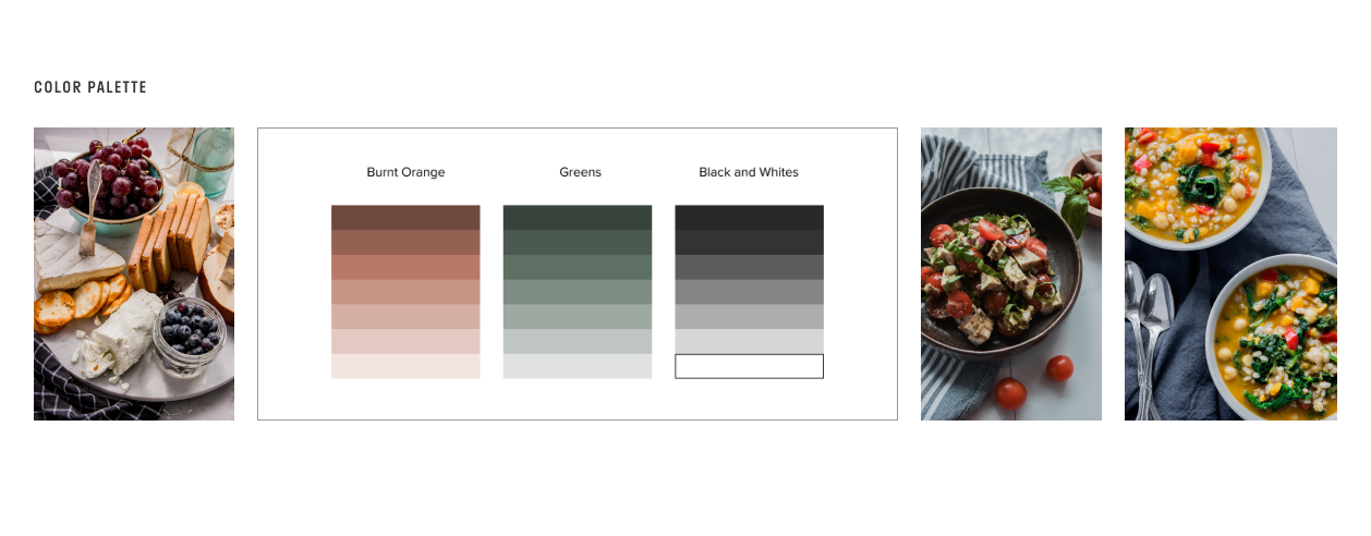
When Carrie (the chef and owner behind Sage foods) sent me the assets and photos for the brand, I realized there was a lot of burned orange and muted greens used throughout. I picked out these tones because I think the tones of orange and green really represent a lot of the ingredients being used in a dish. The orange, almost like a red represents protein and meats alike while the green depicts produce.
After exploring the different layout options in the Ideate phase and defining the styles for the website, I moved on to building out the prototype that I will later be using to conduct usability tests. I did two rounds of usability testing as well. Instead of having a definite pause between prototyping and testing, I did them simultaneously.
For the first iteration of the prototype, I built out some basic functionalities. For the ordering process, I opted for the route where each step is on an individual screen. For this iteration, the payment is still going to be through a third-party app such as Venmo and PayPal.


I did the first round of testing with the prototypes in a moderated usability test session. With that, I was able to gather valuable insights of how users might interact with the website.
After that, I went on and made changes based on the feedback. I did a second round of usability testing using Maze - a remote unmoderated testing service on the web.
I was able to recruit 6 participants between the ages 23 to 35. I didn’t set a criterion that they have to have experience with a meal delivery service. I would say Sage is a combination of instant meal delivery service (takeout) and an at home meal kit (HelloFresh or Blue Apron).
I like to use an affinity map to visualize the feedback I gathered from usability tests because it gives me a good visual representation that allows me to group similar concerns of the participants. This will help me narrow down the changes I need to make for my second prototype iteration.

I thought it was important to implement the feedback I gathered from the usability result and build a second iteration of the prototype.


For this project, I went down a pretty standard design process. Nonetheless, I do realize that I’ll have to check back on my own documentations more frequently. A lot of the hiccups I encountered during the design process (and the usability test that came after) could have been mitigated if I actually referred back to the documents that I created.
Overall, I think having two testing sessions was helpful because I was felt like I was really designing to solve the pain points of users. I think this project is somewhat difficult because without considering the marketing aspect of things, just having good UX is probably not going to help the business grow. But I think having good UX would at least make users feel delighted and confidently choose Sage as their meal delivery service.